Why Color Themes Matter: The Key to Stunning Wedding Photography
- Aug 10, 2024
- 6 min read
Enchanting the Experience - Wedding Photography

Weddings symbolize love and are a blend of sentiments, customs, and aspirations. For a wedding photographer, skillfully capturing these instances is a blend of artistic flair and technical expertise. An often underestimated but vital aspect that significantly impacts wedding photos is the choice of "color scheme". The perfect mix of colors not only elevates the aesthetics of the pictures but also establishes a visual coherence that narrates the day's tale in the most enchanting manner.
1. The Power of Color in Storytelling
Color is a powerful tool in storytelling. Different colors evoke different emotions: warm tones like reds and oranges convey passion and warmth, while cool tones like blues and greens evoke calm and elegance. Aligning the photography with the wedding’s color theme captures the day’s emotions and essence.
2. Creating Visual Harmony
The right color combinations create visual harmony, making every photo look like a piece of art. When the couple’s attire, décor, and lighting complement each other, the images are naturally pleasing to the eye, ensuring a cohesive and beautiful album.
3. Highlighting the Couple
A well-thought-out color theme ensures the couple stands out in every photograph. The colors of the background and surroundings should enhance, not overpower, the couple’s attire. This focus on the couple makes the photographs intimate and personal.
4. Enhancing the Décor
The décor plays a crucial role in wedding photography. Whether it’s the floral arrangements, table settings, or backdrop, the color theme should unify all elements. A cohesive color theme ensures the décor complements the couple and enhances the overall aesthetic of the photos.
5. Simplifying Post-Production
A consistent color theme simplifies the post-production process. With well-coordinated colors, editing becomes about enhancement rather than correction, leading to quicker turnaround times and a more polished final product.
6. Creating a Timeless Look
A classic color theme ensures that the wedding photographs remain timeless. Thoughtful color combinations prevent the photos from looking dated, allowing them to be cherished by future generations as a treasured heirloom.
7. Avoiding Color Clashes
Mismatched colors can create visual discord, detracting from the beauty of the photographs. For instance, pairing bright red with neon green might be jarring, whereas a combination of blush pink and soft gold creates a harmonious and elegant look.
8. Enhancing Emotional Impact
Colors have a profound impact on emotions. A well-chosen color theme can enhance the emotional tone of the photographs, making the joy, love, and excitement of the day more palpable in every image.
9. Supporting the Wedding’s Theme
The color theme should align with the overall theme of the wedding. For example, a beach wedding might feature soft blues and sandy neutrals, while a royal-themed wedding could include deep reds and golds. This alignment ensures that the photographs tell a consistent story.
10. Examples of Good and Bad Combinations
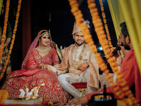
Good: Red & Gold : This combination is classic and elegant, symbolizing wealth and prosperity in Indian weddings.
Bad: Red & Neon Green : The neon green can overpower the richness of red, making the combination too loud and distracting.
Good: Soft Pink & Ivory: This pairing creates a delicate and romantic ambiance, perfect for a serene wedding atmosphere.
Bad: Bright Pink & Bright Yellow: Both colors are too vibrant together, creating a visually overwhelming and chaotic look.
Good: Maroon & Cream: Maroon paired with cream creates a balanced, sophisticated, and regal look.
Bad: Dark Brown & Maroon: The combination of these dark tones can create a heavy and somber appearance.
Good: Lavender & Gold: Lavender and gold together evoke a luxurious and elegant feel, adding a touch of opulence.
Bad: Purple & Bright Orange: These strong colors clash, creating a visually jarring and discordant effect.
Good: Red & Green: A traditional and vibrant combination that is complementary and festive for Indian weddings.
Bad: Silver & Bright Red: The reflective qualities of both colors can create a harsh, metallic look lacking warmth.
Good: Peach & Mint Green: This fresh and vibrant combination is perfect for a cheerful and lively wedding setting.
Bad: Orange & Purple: These bold colors together can feel overwhelming and create a visually clashing aesthetic.
Good: Navy Blue & Silver: A sophisticated combination that adds a touch of luxury, especially for evening weddings.
Bad: Navy Blue & Bright Yellow: The high contrast between these colors can be visually overpowering and unbalanced.
Good: Blush Pink & Rose Gold: This combination is soft and romantic, adding a gentle warmth to the wedding décor.
Bad: Blush Pink & Lime Green: The clash between soft blush and vibrant lime green can create a disjointed and unappealing look.
Good: Emerald Green & Champagne: This rich and refined pairing adds an elegant and timeless feel to wedding photos.
Bad: Emerald Green & Hot Pink: The strong contrast between these colors can create a loud and overly bold appearance.
Good: Turquoise & Coral: This combination is vibrant yet balanced, perfect for a lively and festive wedding.
Bad: Turquoise & Bright Yellow: The pairing of these two bright colors can result in an overly energetic and clashing visual.
11. Coordinating with the Venue
The venue's natural colors should be considered when planning the wedding color theme. For example, a rustic barn with earthy tones might clash with bright, neon colors, while soft pastels would complement it beautifully.
12. Integrating Cultural Significance
Incorporating culturally significant colors into the wedding theme adds depth and meaning to the photographs. For instance, red is often associated with auspiciousness in Indian weddings, while white represents purity in Western ceremonies.
13. Accentuating Key Moments
Certain colors can be used to accentuate key moments in the wedding. For instance, the use of rich gold during the exchange of vows can symbolize the preciousness of the moment, enhancing its significance in the photographs.
14. Setting the Mood
Colors can set the mood for different parts of the wedding day. Soft, romantic colors like lavender and blush can create a serene atmosphere during the ceremony, while vibrant colors like fuchsia and gold can energize the reception.
15. Customizing for the Couple’s Personality
The color theme should reflect the couple’s personality and preferences. A vibrant couple might opt for bold, contrasting colors, while a more traditional couple might choose a classic, understated palette. This personalization adds authenticity to the photos.
16. Working with Natural Light
Natural light interacts differently with various colors. For instance, bright sunlight can wash out pale colors, while deep hues can appear even richer. Understanding this interaction helps in choosing a color theme that looks stunning in the available light.
17. Balancing Modern Trends with Timelessness
While it’s tempting to follow current trends, it’s important to balance trendy colors with timeless ones to ensure the wedding photographs remain appealing for years to come. A mix of trendy accents with classic base colors can achieve this balance.
18. Making Use of Contrast
Contrast can be used to create striking images. For example, a bride in a white dress against a deep green forest background can create a stunning visual impact. However, the contrast should be carefully managed to avoid overpowering the subject.
19. Considering the Season
The season can influence the color theme. Spring weddings might feature pastels and fresh greens, while autumn weddings might embrace rich oranges and browns. Aligning the color theme with the season can enhance the natural beauty of the setting.
20. Ensuring Consistency Across All Elements
From the invitations to the table settings to the couple’s attire, consistency in the color theme ties all the elements of the wedding together. This consistency makes the wedding feel cohesive and well-planned, which translates beautifully in the photographs.
Conclusion
Choosing the right color scheme in wedding photography is more than just a matter of personal preference; it plays a crucial role in enhancing the beauty, emotion, and narrative of your special day. While the color scheme is typically selected by you and coordinated by your event planners, knowing how to manage and blend these colors throughout your attire, decorations, and surroundings can have a significant impact on the outcome of your photos. Through thoughtful selection and coordination of colors, you can ensure that your wedding photographs not only encapsulate the essence of the occasion but also elevate it to a timeless, visually captivating memory. Keep in mind that the colors you opt for serve as the cornerstone of your photographic legacy as you prepare for your big day.


Comments